Decadent Deity (Vore Game)
Semi linear vore platformer, public itch builds are one version behind Patreon . With how long it takes to develop new art and features expect new content every 2 - 3 months.
https://www.patreon.com/Spanks218
Currently features OV and AV with some clothing entrapment
To see new content as it's developed follow the project on our Discord
| Status | In development |
| Platforms | HTML5, Windows |
| Rating | Rated 3.9 out of 5 stars (59 total ratings) |
| Author | Spanks |
| Genre | Platformer |
| Made with | Godot |
| Tags | 2D, Adult, Erotic, Furry, Metroidvania, Pixel Art, Queer, Singleplayer, vore |
| Average session | A few minutes |
| Languages | English |
| Inputs | Keyboard, Mouse |
| Links | Patreon, Twitter/X, FurAffinity |
| Content | No generative AI was used |
Download
Download NowName your own price
Click download now to get access to the following files:
Decadent Deity 0.0.28.zip 61 MB
Development log
- Forest Patreon UpdateJul 29, 2025
- Sorry! Tweaks and Fixes!Mar 26, 2025
- Ayla & Sound Update Public/Web ReleaseMar 23, 2025
- Ayla and Sound Update!Feb 22, 2025
- Two New Enemies!Dec 26, 2024
- New player model, new energy level, and game story outlineDec 13, 2024
- Total Overhaul & Slime Enemy New LevelNov 21, 2024
- Decadent Deity Feel Update 0.0.17Oct 25, 2024
Comments
Log in with itch.io to leave a comment.
this game is like the vore side bat the game side is mad of shit.
When i press W while was being nomed, game crashed
hey game dev uhh, thanks for the random prey awakening on a random friday. i didnt expect it to go this way but i am now suddenly too prey-brained to be mad @w
haven't seen a post in months I hope you're okay
Still any plans to make the game playable on Android?
Bro said 1 month after patreon, been 44 days and nothing
Public builds are now one update behind patreon builds. I can't create full quality updates with multiple enemies in that time.
Thanks for letting us know
i hope the public relase of forest update is soon :/
目前有考虑过制做手机版本吗?
I kinda wish that Ayla and Kira had internals, but I understand it isnt a priority. (but I do hope for a standard anal vore enemy)
am I not supposed to get past the door mimic (T_T)
Would you mind switching to a more legible font? Something like Arial or Calibri would be great.
Fun game and concept here. Since this is already kind of an 18+ game, is there any possibility you're considering adding NSFW bits, like say genitals on the player character and enemies? Would absolutely love to see that added to this game as an option, you don't see too many vore games that fully embrace the 18+ aspect sometimes.
Yeah, I think the player character is going to stay gender ambiguous but in future I'd like to have CV and UB enemies so naturally they would have genitals :3
You should make a mobile v version for people with old computers that can't run it
That title being changed gave me hope for a new update so bad
The sentence in the description: "Soft vore with digestion up to your interpretation" Is in desperate need of a comma between vore and with.
This will be fixed in the next update, the platforms have been made one way platforms and I've put in checks that unstick the player from the floor
Good job :)
Can there be multiple endings... here me out getting upgrades im totally guess can be based off items or fighting back like you know eating them?
Multiple endings sounds very ambitious lol. I think that is potentially a bit out of scope for me just being a single developer to make multiple endings to an interesting degree beyond like a final choice at the end. But that would be very fun.
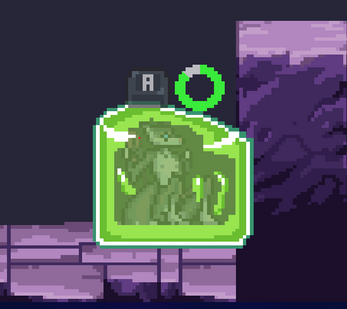
I got a bug with the slime where i was on the last struggle to get out but it wouldnt let me escape even when i got the key right, just thought id say something :
Hi! I have a really hard time reading the text in this game, would it be possibly to add a black outline or drop shadow to the text or even a dyslexia friendly font so it's easier to read?
I'll try to add in a bordering to text that makes things more visible :3
You don't have to respond to this, but is it possible you might make a mobile version in the near future, as if you try to play it on most mobile devices, the game just gives you a "As snap" if you try the browser version, and because its a .ZIP file, you have to unzip it first, but when you unzip files on mobile, A lot of files from those game files become HTML for some reason
I think the same thing that goes for the mobile version is true for controller support. I've been playing around with the implementation of controller support and I have it mostly working apart from making the player able to sprite from double tapping the movement keys. I think once everything is in place I should be able to make a mobile version fairly easily by adding movement buttons to the screen
TLDR : Yes that should be coming probably by the next update if all goes well
will it work on iOS or just android?
I think mobile ports are only Android
in the third level, on the first lever where you have to solve the puzzle with the lifting platforms, it feels impossible to make it back up due to the lever to switch the moving platform being to far from the lever to jump on because it starts moving instantaneously after hitting it. I could also be dumb any one help me?
Things of note I've found:
• Both the tutorial and third level are impossible to beat as the gaps are too small to jump to since you just end up hitting you're head and falling. Specificly the jump near the end of the tutorial level and the area where the only worm on level three is.
• The mouth is still not on the enemy select screen. (I thought this would have been fixed by now but aparently it just got forgoten.)
• Slimes can aparently get stuck under lever operated elevators. This can only happen on the third level when going down from the staring area (not really an issue I was just was hoping it would've exploded lol)
• Struggling mechanic feels janky (I don't know if the struggling mechanics were changed in some way but it feels way different from v0.0.21 and I don't like it very much.)
• Interaction hitbox (This I know was changed since it's way harder then it was to get into and out of save areas.)
Don't take this as me hating on the game since it's not. Also if there's 2 things I'd want to see it be being able setting to change it from binaural to monaural audio since I don't use headphones and a sandbox opition.
I appreciate the feedback even though it's hard to hear sometimes lol
I've fixed and tweaked a lot of things that you mentioned
There is a devlog now on the fixes and changes let me know what you think :)
Also I'll have to add the mono setting I'll have to figure out how to implement that I'll probably patch that in soon
Sadly the tutorial is still imposible to beat because this mfing Mr. Concussion-giver who single handedly ruins this entire setup and the jump to that block doesn't even seem possible either.
Fortunately I've came up with a very simple solution that will probably work: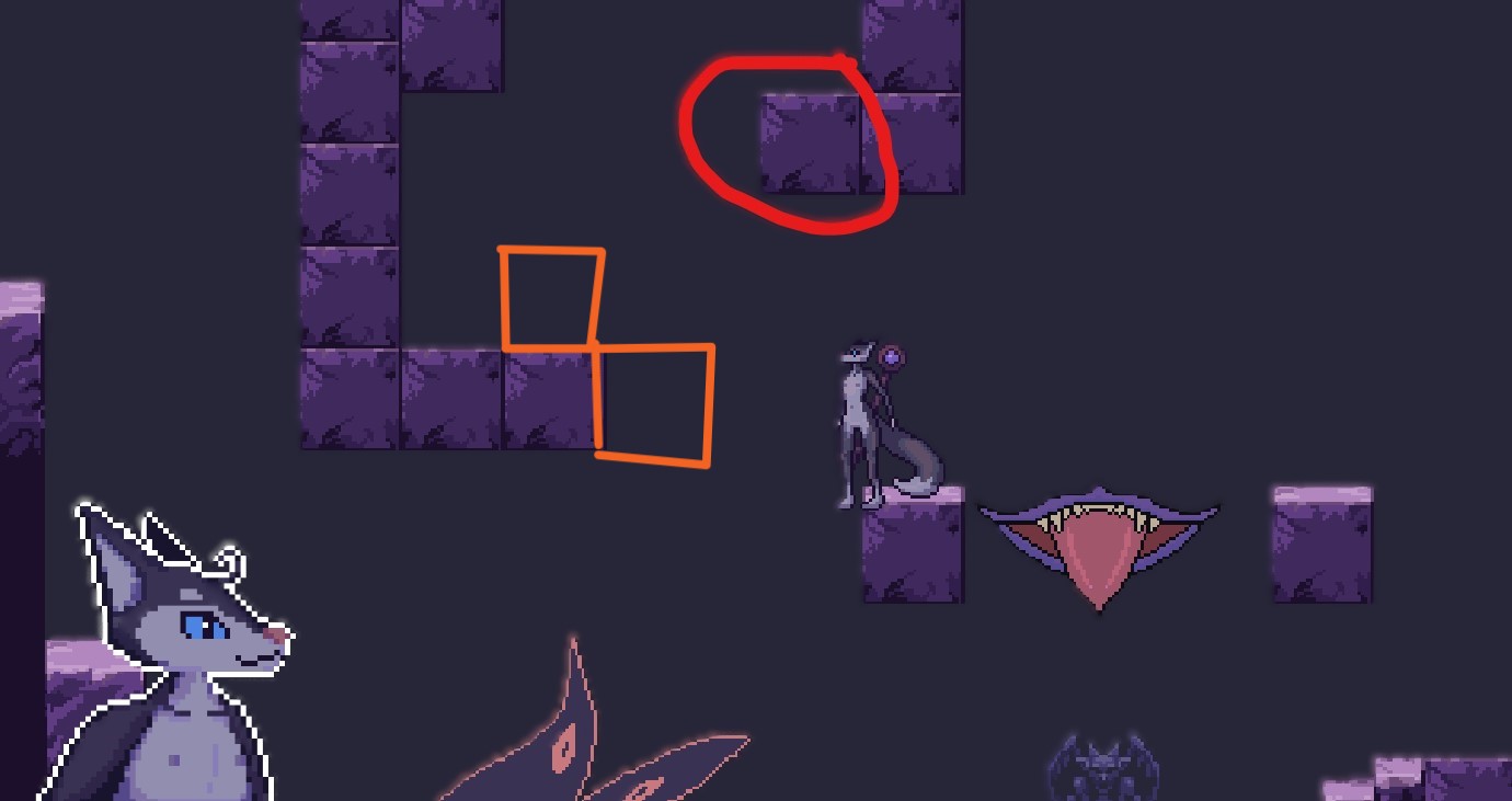
Now with that said I hope this helped.
Any chance you could make a mobile port or control setting for the game? It looks really interesting and I'd like to try it
I actually started to work on controller support for the game, I should have controller support coming soon.
I'll have to change the way sprinting works and make double tapping directional inputs make you sprint as well as the shift key
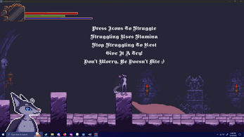
The updated tutorial should help with that. You need to recharge your stamina to be able to escape. It wasn't explained well before.
Eh not the greatest, just struggle simulator that does way too much
Are you considering making an Android version?
I'd like to since I made the game in compatibility mode but I can't give a firm timeline on that, I'm really just pushing to create more content and there is a lot of coding and development needed for these new enemies I'm trying to introduce
Could you add controller support?
I actually started to! I have the bones of it all worked out rn I just need work on controller connection
Fun game, though on windows the camera can glitch out to just begin floating upward until it passes the skybox, even on the first three enemies. Other than that it's a rather fun game.
Really? I'm going to change the way the camera is positioned to the player
It's only occasional, sometimes if functions as intended, other times you'll be introduced to the skybox.
lol that's a funny way of putting it, I'll make some changes and get that fixed :3
So far I haven't had any issues with it (as of the 0.25 releace cause I'd rather wait a month than pay $3 for "early access". Now that you're gonna claim to put out an update HERE it better be HERE.) however it did take me then I'd like to admit to figure out there was a sprinting mechanic simply because I didn't try to sprint as there was literally no mention of one (shift is sprint btw).
You're right I realize now that's confusing and I'll post the dev logs here when it goes public, also I redesigned the tutorial to better go over all of the controls
omg really?
Is the update for the browser ver? Nothing seems to have changed if so.
The update won't be officially released to this site till next month. They were just advertising it here so people would be more likely to get "early accees" to it on their patreon.
Oof, thats a very overtuned game. The struggle mechanic is a nightmare on the default setting. And yes, I know about the stamina bar.
Jumping is also very confusing. The game's lack of tiles makes its very difficult to tell how far you can jump and whether you can make jumps.
worm at new game is bugged freezes the game, and are unable t progress past it
I haven't seen that bug reported. Which worm is causing the issue for you, where is the worm, and what causes the issue?
it is the first multi eyes worm with the big tongue that you have to jump over after you pull the first lever to raise the door blocking your way
Is that in the web version or the new patron version?
the new version from itch
In the latest update the flux beast in the level select menu was replaced with a black box. perhaps the file was renamed and references to it were not ammended.
my take is that if you do some CV that some male preds are coming in the future (which i am happy about.)
Please make them also do OV, i have seen them in other games only doing CV and that is such a waste.
┻━┻ ︵ \( °□° )/ ︵ ┻━┻
Sorry about that I have no way of bug checking the Linux version. I think in future Linux versions will drop off and the game will have to be ran with wine unfortunately
Really??? I'm sorry
Mobile controls please!
I have some basic controller support coming with the new version!
hello friends wanted to say this is a good plat-former. I officially named the worm creatures Jeff and fuck face guess witch is witch. love the way you did the slime patch physics and also love the platforming.
one thing tho I never saw a text box saying you could sprint and how to you might want to add that so people know that it is feature.
Linux build has a few bugs:
please make it mobile friendly
So, not sure if you updated the tutorial in the browser version, but:
Right after the switch, it is nearly impossible to get past the worm enemy. It is also impossible to go back, as the jump to the previous section is a single tile too tall, which means you cannot try going around the worm.
Also, if the worm eats you, and you press w before going fully down, the screen turns grey, and starts to lag the browser as it draws on more and more memory.